Mobile is where you find out what your dashboard is for
I built OpenWatch to track security incidents across Nigeria. On a 27-inch monitor it looked the way I wanted: a live map, an intel feed down one side, filters across the top, a confidence score on every incident. Everything, at once.
Then I opened it on my phone, which is exactly where someone would actually need it, and it fell apart.
Not because it was cramped. It fell apart because on a phone, “here is everything” is not an answer to any question. And once I saw that, I couldn’t unsee it on the desktop version either.
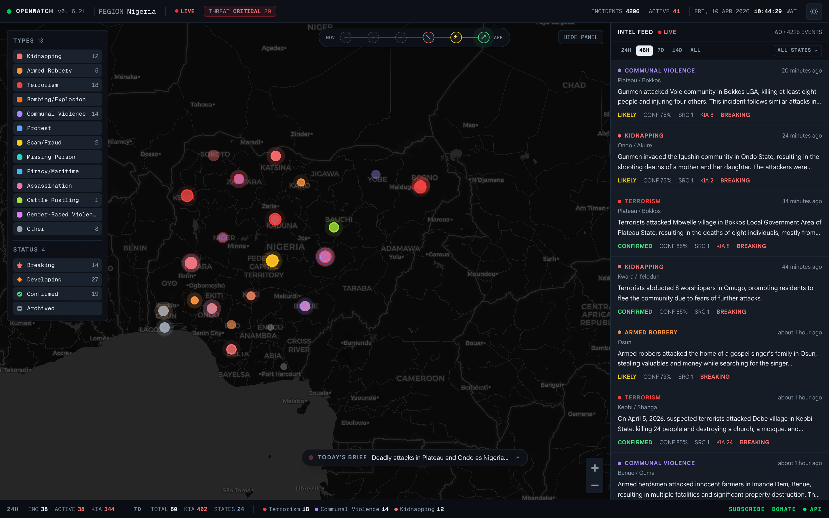
The same dashboard, both ways. Toggle it. Nothing was removed. The order of importance changed.
A dashboard is a question, not a wall of data
Every dashboard exists to answer one question. What needs my attention? Are we on track? What changed since yesterday? The screen is just how the answer gets delivered.
On a big screen you can avoid deciding what the question is. There is room, so you show the map and the feed and the filters and the table, and you let the user assemble the answer themselves. That feels generous. It is actually you handing them the hard part.
The phone won’t let you do that. There is no room to punt. You have to know, before you place a single element, which decision the user came to make.
Mobile is a different job, not a smaller screen
The desktop dashboard and the mobile one do different jobs, and confusing them is the whole problem.
Desktop is for exploration. Wide screen, a mouse, someone sitting down with time. You lay things out in parallel so the eye can move across them and compare. Breadth is the point.
Mobile is for triage. One thumb, a few seconds, usually standing up and half-distracted. You lay things out in sequence: the one thing that matters, then the next, then a way to go deeper. Depth on demand is the point.
On OpenWatch, the desktop sets the filters, the map, and the live feed side by side, and you scan across them. The phone cannot do side by side. It stacks them: the map first, then the feed one item at a time, with the day’s brief pinned at the top. Same data. You read down to what matters instead of taking it all in at once.
I have made this move enough times to trust it. On Washcast, a laundry app, the phone leads with a single verdict (“Good drying weather. Medium to heavy items work well.”) and keeps the humidity and wind behind it. At the Weather Channel, we took the Activity Hub from a list of notifications and turned it into a triage screen: what is happening near you, ranked, right now. The pattern never changes. Lead with the one thing that matters, and let the rest wait until asked.
Design the phone first
So I design the phone first now, even for products that mostly get used on desktop.
Not because mobile matters more. Because the phone is a forcing function. It has room for about one number and one action above the fold. To fill that space you have to answer the question you were avoiding: of everything on this screen, what is the single most important thing?
Once you have that answer, the desktop layout stops being hard. The most important thing gets the most space and the top-left corner. The next gets the next. The show-everything view still exists, but now it is a mode you choose, not the default you reached for because you couldn’t decide.
On Nexus Portal I designed four dashboards, one each for admins, mentors, students, and parents. Four times I started with the same question: if this person could see only one thing on their phone, what is it? Admin, revenue this month. Mentor, your next session. Student, the same session, but as a countdown, not a calendar. Parent, the invoice due. Four screens fell out of four one-line answers.
What actually changes at the breakpoint
Responsive design taught a generation of us that mobile is desktop with the columns stacked. For a marketing page, fine. For a dense dashboard, that is how you get a long scroll of shrunk widgets nobody reads.
The things that actually change are not the columns.
- Density becomes decision. On desktop you show forty rows and let the user filter. On mobile you show the three that matter and put the other thirty-seven behind a tap. You do the filtering for them.
- Hover has to die. Half the affordances on a desktop dashboard live in hover: tooltips, row actions, the number that appears when you point at a bar. None of it exists under a thumb. If a value needs a tooltip to make sense, it needs a different treatment on mobile, not a hidden one.
- Parallel becomes sequential. The filters strung across the top of the desktop become one sheet you open, choose from, and dismiss. One choice at a time instead of every choice at once.
- The overview becomes a place you go. Desktop lands on the everything-view. Mobile lands on the one-thing-view, and the everything-view is one tap away for when you actually want to explore.
The phone is the best editor you have
It has no patience for anything that isn’t the point. Every element has to earn its place against one question, because there is no room for the ones that don’t.
That edit is not a compromise you make for small screens. It is the clarity the desktop version was missing. The dashboards I am proud of all got sharper on the wide screen after I built them for the narrow one.
So when a dashboard feels bloated and you can’t say why, open it on your phone. It will tell you what the thing is actually for. Then go build that, at every size.